Lotta Sandebäck
Member's List
Background / Problem
In 2021 we needed to deal with technical depth in our “team” feature in the product. For a customer, it looked like the teams were linked to each other, but they weren’t.
The product wasn’t built from the start with the thought of customers needing more than one team. So as a quick-fix, they added more teams, but you, as a user of the product, had to be invited to each team to be able to see them. The problem with this was that the customer wouldn’t know how many teams they had, if they weren’t invited. They didn’t have an overview over their company profile.
Company:
Detectify
My role:
Product Designer
Team:
Product Designer
Product Manager
3 Developers
UX Researcher
Timeline:
1 Month
Process
01
Customer interviews

We had gotten a lot of feedback from various interviews over the last year, as we had interviews with customers weekly. We decided to add some more interviews that tackled this subject specifically.
02
Solution tree
Because the app wasn't built as an organization with teams, this meant changing the foundation of the app. Due to this highly complex task, that would involve all teams, we had to figure out what was something we, as a team, could do right now - “Start small”.

03
Quick Design
After this, I and another developer started designing a better overview for the customer. For now, this overview is just “per team”, but in the future we would use the same kind of design to view all teams within a company.
04
Testing
The design was released to a limited audience to gather real feedback, to validate assumptions about the user needs.
05
Keep adding features
We continued to iterate on the page based on feedback from ongoing interviews, slowly adding more features.
Design Before

Design After


Key changes
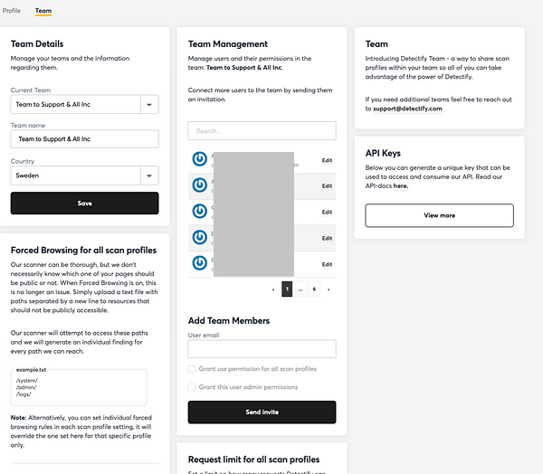
Overview of Team Members
Adding new user
The member's were displayed in a little box that was hard to navigate through. You could only see 5 at a time, and sometimes the user list were 100s. It was hard to get an overview.
Solution: Moved out the members list to it's own tab, where the member's list were in focus.

When editing a member, the box changed to an 'edit mode', which was quite an unusual ui pattern. It made users confused on what was happening
Solution: Instead we made the edit instant. In the list there was a way to edit the member directly.


Edit Member
When editing a member, the box changed to an 'edit mode', which was quite an unusual ui pattern. It made users confused on what was happening
Solution: Instead we made
the edit instant. In the list
there was a way to edit
the member directly.

Permissions
Nobody seemed to understand the checkboxes that decided what permission the member had. There were two checkboxes but there were 4 different permissions rights depending on what combinations you did.
Solution: We decided on three different permissions right: admin, edit, view, in which the user selected with a select dropdown.
Struggles
Technical Depth
This was just the start of the project. We decided to due what we could do on our end before involving every other team; interrupting their roadmap. We wanted to wait until every one was ready to start this very complex task together.